Bioprocess Optimization
Bioprocess-Optimization.RmdOverview
In this article, a dataset originating from the biotechnological industry will be analyzed. It was originally published with the book Applied Predictive Modeling. The goal of the study, during which the data was generated, was to maximize the process yield. To achieve this, 57 different process variables were varied. In total, 176 processes were performed. All variables except the features were masked. Our aim is to explore the data and visualize what influence the process parameters had on the yield.
Note: The raw R code that is used in “Advancing Modern Data Science Methods in the Field of Bioprocess Engineering” can be found here.
Preparing the data
At first, the ChemicalManufacturingProcess data set (originally from the AppliedPredictiveModeling package) is loaded and transformed into a data.table. The process variables are also given shorter names, so that the interactive plots generated later become easier to read.
library(lionfish)
library(data.table)

data(ChemicalManufacturingProcess)
data <- data.table(ChemicalManufacturingProcess)
col_names <- names(data)

mp_cols <- grep("^ManufacturingProcess", col_names, value = TRUE)
bm_cols <- grep("^BiologicalMaterial", col_names, value = TRUE)

new_mp_names <- sub("^ManufacturingProcess", "ManPr", mp_cols)
new_bm_names <- sub("^BiologicalMaterial", "BioMat", bm_cols)

setnames(data, old = mp_cols, new = new_mp_names)
setnames(data, old = bm_cols, new = new_bm_names)
Since the dataset contains many missing values, these need to be addressed before proceeding with the analysis. First, all observations (rows) with more than three missing values are removed. Next, all features (columns) with more than three missing values are also excluded. Following this, extreme outliers are identified and removed. Finally, any remaining columns that still contain missing values are eliminated to ensure a clean dataset for analysis.
data <- data[rowSums(is.na(data))<3]
data <- data[, lapply(.SD, function(x) if (sum(is.na(x)) <= 3) x else NULL)]
data <- data[-c(99,153,154,158,159,160)]
data <- data[, lapply(.SD, function(x) if (sum(is.na(x)) <= 0) x else NULL)]
To visualize the distribution of yield, the data is first categorized into 10 groups based on yield values. These groups are then visualized using a histogram to provide an overview of the yield distribution. The labels of these groups are also stored for use in later stages of the analysis.
min_yield <- min(data$Yield, na.rm = TRUE)
max_yield <- max(data$Yield, na.rm = TRUE)

intervals <- seq(min_yield, max_yield, length.out = 11)
yield_values <- findInterval(data$Yield, intervals, rightmost.closed = TRUE)
yield_labels <- paste0("Yield ", head(intervals, -1), "-", tail(intervals, -1))
library(ggplot2)
library(viridis)

yield_values_factor <- factor(yield_values, labels = yield_labels)

ggplot(data, aes(x = Yield, fill = yield_values_factor)) +
  geom_histogram(binwidth = (max_yield - min_yield) / 30, color = "black") +
  scale_fill_viridis(option = "plasma", discrete = TRUE) +
  theme_minimal() +
  labs(title = "Histogram of the process yield",
       x = "Yield",
       y = "Count",
       fill = "Yield Intervals")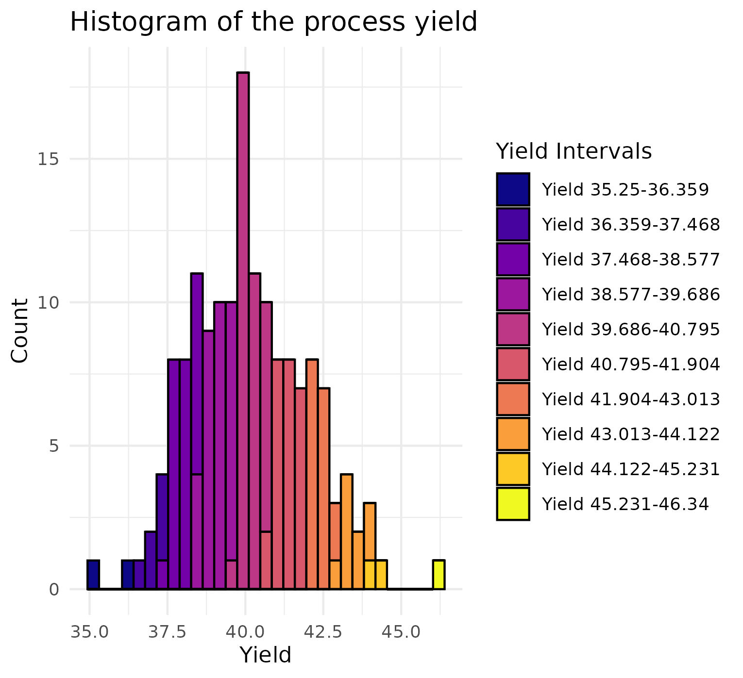
Finally, the data is standardized and the yield removed.
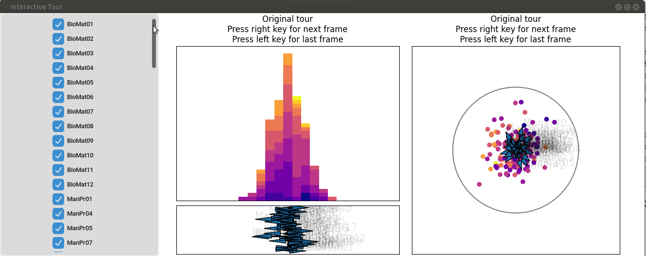
Visualizing the full dataset
With the data prepared, visualization can now be performed using the lionfish package. First, the Python backend is initialized with the init_env() function. Two tour history objects are then generated using the tourr package. Both tours utilize the linear discriminant analysis (LDA) projection pursuit index, which is designed to maximize the separation between the 10 yield groups. One tour history object projects the data into 1D, while the other projects it into 2D.
Next, an appropriate initial value for the half range of the display is estimated. The half range serves as a scaling factor, determining how spread out the data appears in the graphical interface. Initially, the estimated value caused the data points to appear too close together. To enhance the visualization, the half range was reduced by half, resulting in a more effective and visually clear display of the data.
Following this, the plot objects were defined. Plot objects are named lists that specify the type of display to be shown along with additional display-specific information. In this case, a “1d_tour” and a “2d_tour” were selected, and the previously generated tour histories were assigned to these objects.
if (check_venv()){
init_env(env_name = "r-lionfish", virtual_env = "virtual_env")
} else if (check_conda_env()){
init_env(env_name = "r-lionfish", virtual_env = "anaconda")
}
lda_tour_history_1d <- save_history(data_wo_y,
                                    tour_path = guided_tour(lda_pp(yield_values),d=1))

lda_tour_history_2d <- save_history(data_wo_y,
                                    tour_path = guided_tour(lda_pp(yield_values),d=2))

half_range <- max(sqrt(rowSums(data_wo_y^2)))
feature_names <- colnames(data_wo_y)

obj1 <- list(type="1d_tour", obj=lda_tour_history_1d)
obj2 <- list(type="2d_tour", obj=lda_tour_history_2d)
Finally, an interactive tour is initiated to allow for a closer and more detailed exploration of the data.
if (interactive()){
interactive_tour(data=data_wo_y,
plot_objects=list(obj1, obj2),
feature_names=feature_names,
half_range=half_range/2,
n_plot_cols=2,
preselection=yield_values,
preselection_names=yield_labels,
display_size=display_size,
color_scale="plasma")
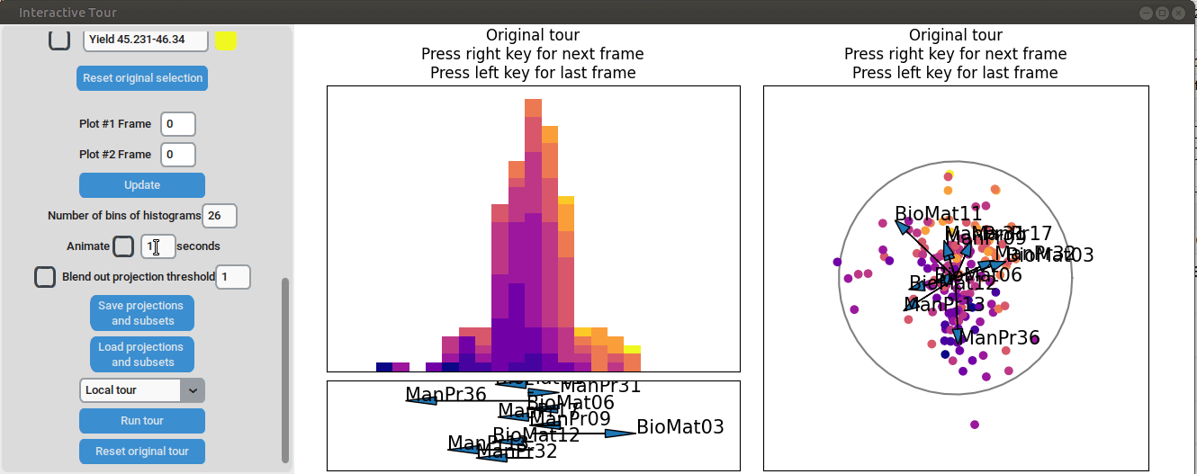
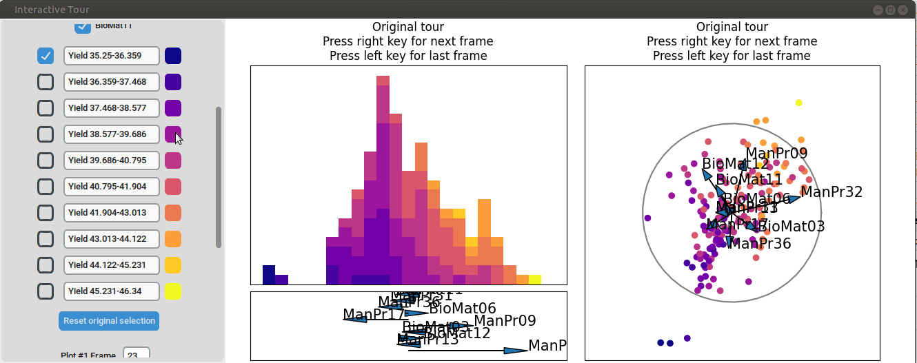
}First, the “Blend out projection threshold” is set to 0.2. This setting ensures that projection axes with a norm of less than 0.2 are blended out, reducing visual clutter in the plot and making the visualization easier to read. Now the user can progress to the next frame, either by animating the tour by checking the checkbox next to “Animate” or by using the arrow keys. As the animation progresses, noticeable separation between the yield groups begins to emerge around frame 10 and becomes even more pronounced from frame 30 onward. Projections that explain the differences in yield can easily be identified during this process. Note that the animation speed may be slightly slower depending on the rendering time of each frame.
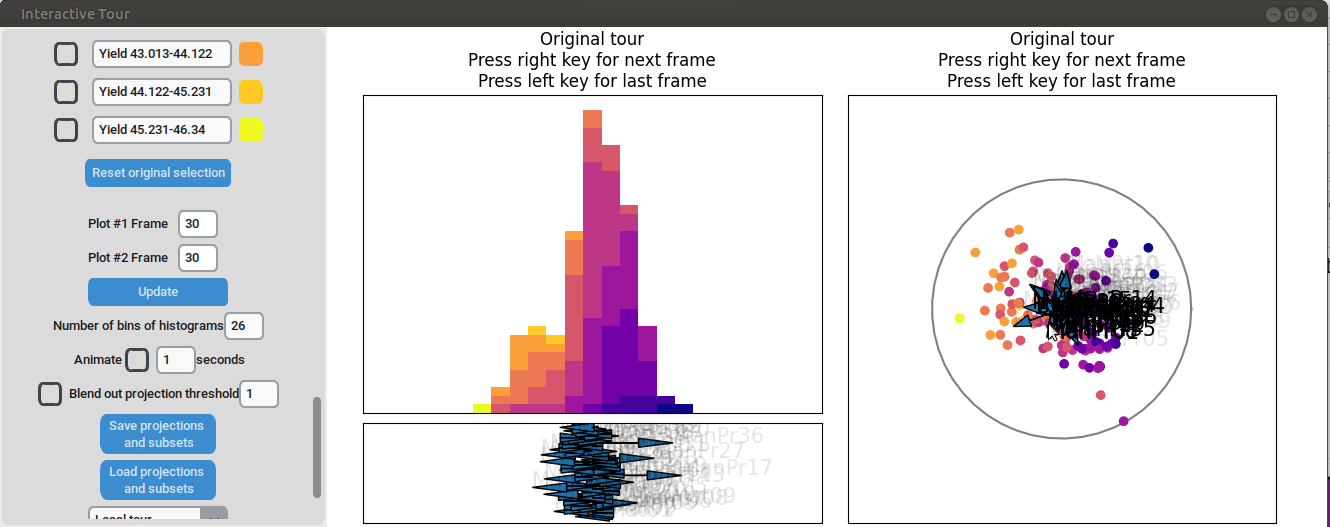
Projection axes pointing toward the high-yield groups indicate a strong positive influence on yield, while axes pointing away from these groups suggest a negative influence. To better understand the role of each axis, the mouse cursor can be hovered over the arrowheads to reveal the original process parameter each axis represents, which is otherwise greyed out. Additionally, axes can be adjusted by dragging and dropping the arrowhead with the right mouse button, allowing for interactive exploration of the data.
For instance by adjusted the axis representing the feature manufacturing process 09 (“ManPr09”). Extending this axis in the direction of the high-yield groups doesn´t affect the separation much, while dragging it in the opposite direction results in the disappearance of the separation. This suggests that high values of feature manufacturing process 09 are associated with higher yields. However, when the axis is reversed to point in the opposite direction, the yield groups begin to mix. This indicates that manufacturing process 09 alone is not sufficient to fully explain the yield. If it were, reversing the axis would simply invert the scatterplot while maintaining the alignment of the high-yield groups with the manufacturing process 09 axis.

Further exploration involves adjusting other axes to uncover potential interactions between the features. For instance, elongating the axis representing manufacturing process 32 alongside the axis for manufacturing process 09. To illustrate this, both axes can be dragged in the opposite direction, resulting in a projection that fails to effectively separate the yield groups. This indicates that manufacturing process 32 is also correlated with the yield. If manufacturing process 32 was not important, the separation resulting from manufacturing process 09 alone would remain unchanged. When the axes of manufacturing process 32 is oriented to point in the same direction as manufacturing process 09 the separation is again quite noticeable. To investigate this further, both axes are then oriented to point in the opposite of the original direction, resulting in the scatterplot getting somewhat inverted. However, the separation achieved in this projection is not as distinct as in the original visualization. This suggests that while manufacturing processes 09 and 32 are important and positively correlated with the yield, additional features are required to fully explain the differences in yield.
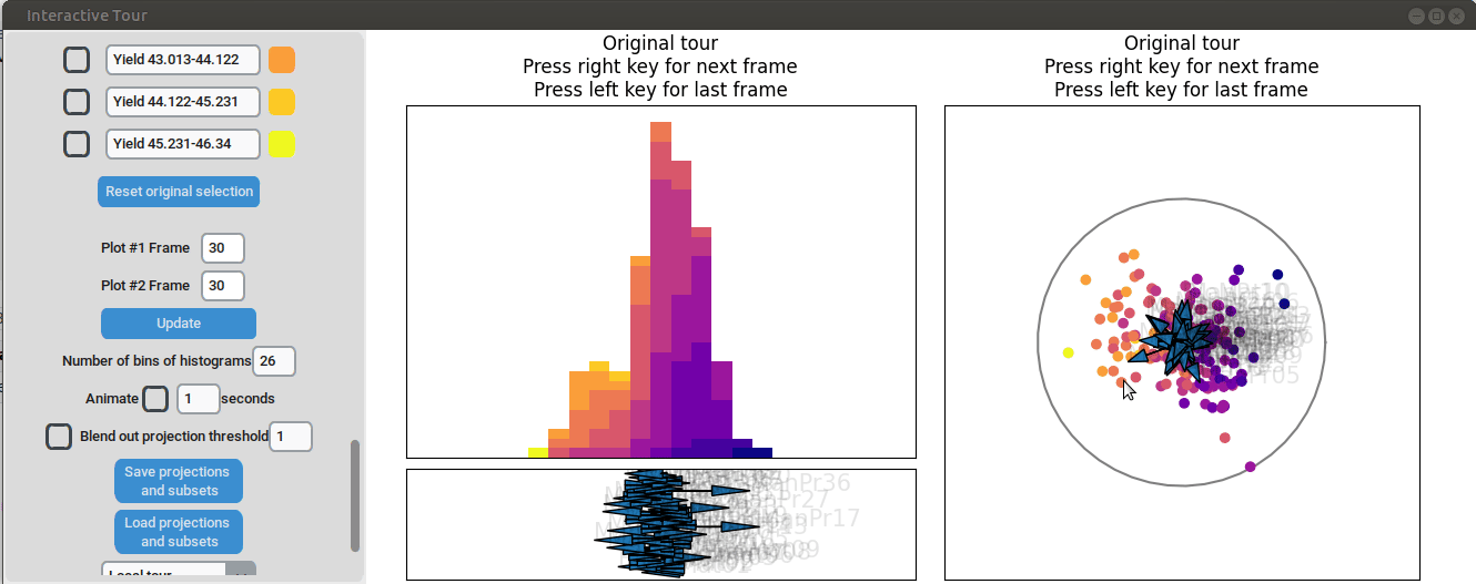
Additional process parameters are varied to capture more interactions and structural patterns. For instance, adjusting the axis representing manufacturing process 31 highlights an outlier with a low value for this parameter (positioned in the opposite direction of the axis) that achieved a slightly above-average yield

Similarly, varying manufacturing process 40 results in two clearly separated groups, suggesting that this variable had two discrete values. Since both low- and high-yield observation are present in both groups, there is no clear indication that manufacturing process 40 had a strong correlation with the yield.
Feature preselection with random forests
With an initial overview of the data established, the visualization is refined by fitting a random forest model to predict yield based on the other process variables and selecting only the most important variables according to the model. For this analysis the 10 most important features have been chosen.
if (requireNamespace("randomForest")) {
  set.seed(42)
  library(randomForest)
}
if (requireNamespace("randomForest")) {
  rf <- randomForest(Yield~.,data)
  importance_df <- data.frame(rf$importance)
  importance_df <- as.data.table(rf$importance, keep.rownames = "Feature")
  sorted_importance <- importance_df[order(-IncNodePurity)]
  top_10_features <- sorted_importance[1:10, Feature]
  print(top_10_features)
}
#> [1] "ManPr32" "ManPr13" "BioMat12" "BioMat03" "ManPr09" "ManPr17"
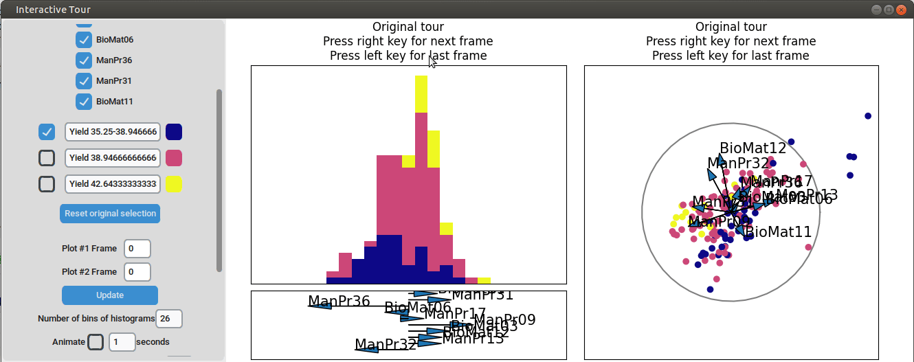
#> [7] "BioMat06" "ManPr36" "ManPr31" "BioMat11"From the R output, it is determined that the 10 most important process parameters, as identified by the random forest model, are manufacturing processes 09, 13, 17, 31, 32, and 36, along with biological materials 03, 06, 11, and 12. As the next step, the dataset is reduced to include only these selected variables. The data is then visualized using the same approach as before, allowing for a more focused exploration of the key factors influencing yield.
if (requireNamespace("randomForest")) {
  data_rf_sel <- data[, ..top_10_features]

  grand_tour_history_1d <- save_history(data_rf_sel,
                                        tour_path = guided_tour(lda_pp(yield_values),d=1))

  lda_tour_history_2d <- save_history(data_rf_sel,
                                      tour_path = guided_tour(lda_pp(yield_values),d=2))

  half_range <- max(sqrt(rowSums(data_rf_sel^2)))
  feature_names <- colnames(data_rf_sel)

  obj1 <- list(type="1d_tour", obj=grand_tour_history_1d)
  obj2 <- list(type="2d_tour", obj=lda_tour_history_2d)
}
if (interactive()){
interactive_tour(data=data_rf_sel,
                 plot_objects=list(obj1,obj2),
                 feature_names=feature_names,
                 half_range=half_range/2,
                 n_plot_cols=2,
                 preselection=yield_values,
                 preselection_names=yield_labels,
                 n_subsets=10,
                 display_size=display_size,
                 color_scale = "plasma")
}
At the initial frame, some separation between the yield groups is already visible. The separation between yield groups become much more pronounced at the final frame. Notably, the extreme yield groups are even better separated compared to the projection that included all process parameters. By the final frame, it becomes evident that manufacturing processes 09 and 32, as well as biological material 12, have a positive influence on yield, while manufacturing processes 17 and 36 exhibit a negative influence.
To further enhance the separation between groups with particularly low and high yields, a quick approach involves adjusting the opacity of the groups that are less relevant to the analysis. This allows for a clearer focus on the groups of interest. A local tour can then be initialized to search for projections that better separate the highlighted groups.
When an interesting frame is identified, it can be saved by pressing the “Save projections and subsets” button. This saves the state of the analysis so it can be shared and be continued later. To reload the saved state of the analysis, the “Load projections and subsets” button of the GUI can be pressed. The folder containing the save then has to be selected using the pop-up window. Alternatively, the saved state can be loaded programmatically using the load_interactive_tour() function.
A different approach of doing this would be to define only three yield bins and run another guided tour.
intervals <- seq(min_yield, max_yield, length.out = 4)
new_yield_labels <- paste0("Yield ", head(intervals, -1), "-", tail(intervals, -1))

new_min_yield <- min(data$Yield, na.rm = TRUE)
new_max_yield <- max(data$Yield, na.rm = TRUE)

new_intervals <- seq(new_min_yield, new_max_yield, length.out = 4)
new_yield_values <- findInterval(data$Yield, new_intervals, rightmost.closed = TRUE)
if (requireNamespace("randomForest")) {
  grand_tour_history_1d <- save_history(data_rf_sel,
                                        tour_path = guided_tour(lda_pp(new_yield_values),d=1))

  lda_tour_history_2d <- save_history(data_rf_sel,
                                      tour_path = guided_tour(lda_pp(new_yield_values),d=2))

  half_range <- max(sqrt(rowSums(data_rf_sel^2)))
  feature_names <- colnames(data_rf_sel)

  obj1 <- list(type="1d_tour", obj=grand_tour_history_1d)
  obj2 <- list(type="2d_tour", obj=lda_tour_history_2d)
}
if (interactive()){
interactive_tour(data=data_rf_sel,
                 plot_objects=list(obj1,obj2),
                 feature_names=feature_names,
                 half_range=half_range/2,
                 n_plot_cols=2,
                 preselection=new_yield_values,
                 preselection_names=new_yield_labels,
                 n_subsets=3,
                 display_size=display_size,
                 color_scale = "plasma")
}
It can be seen that this results in an even better separation. Again, another local tour is initiated to see if we can further improve separation or observe other interesting projections.
An alternative approach that maintains the original 10 yield groups involves launching the GUI with these groups and initiating the “Guided Tour - LDA - Regroup” feature directly within the interface. This process allows the original yield groups to be reorganized into new subgroups through binning. The resulting projections from the guided tour LDA reflect the newly defined subgroups while still displaying the original grouping.
Conclusion
The analysis demonstrates how the lionfish package can be effectively used to gain a quick and comprehensive overview of a complex dataset. Key process parameters influencing the yield were identified, along with insights into whether their influence was positive or negative. Additionally, the interactive displays showcased how underlying structures within the data can be quickly uncovered, providing a powerful tool for exploratory data analysis and decision-making.